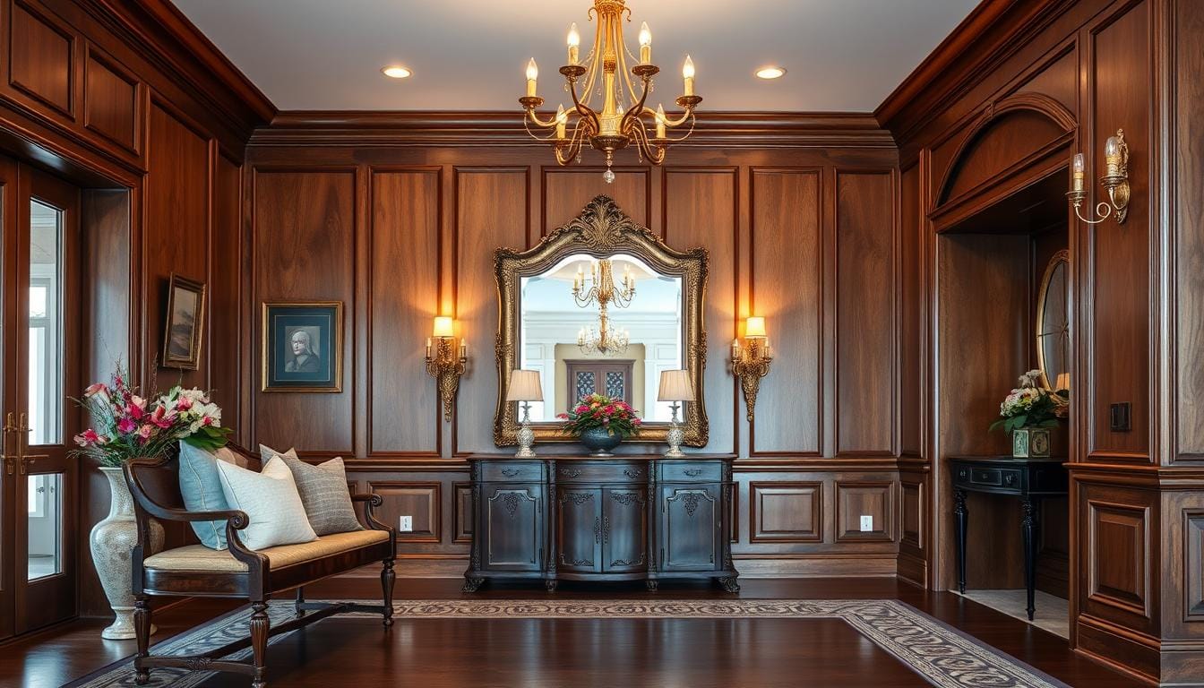
Last month, I walked into my friend Jen’s house and immediately froze. Her entryway had this glow – a cozy bench draped with textured pillows, a vintage mirror reflecting sunlight, and a woven basket holding shoes neatly. It wasn’t just pretty. It felt like a warm hug. That’s when it hit me: our entry spaces aren’t just pass-through zones. They’re silent storytellers.
Your home’s entrance works harder than you think. It’s where guests form opinions, where you kick off your shoes after a long day, and where daily life begins. But here’s the secret: you don’t need a grand foyer to make magic happen. Even tiny spaces can pack personality and purpose.
Over the years, I’ve learned that great design here isn’t about trends. It’s about blending function (where do keys live?) with flair (what makes you smile when you walk in?). We’ll tackle clever storage fixes, lighting tricks, and how to showcase what makes your home uniquely yours – all without breaking the bank.
Ready to turn that “meh” area into a memorable first act? Let’s start reimagining your space together.
Transform Your Entryway into a Welcoming Space
Last summer, I helped my neighbor Sarah rework her cramped front area. What started as a cluttered corner became her favorite spot – proof that intentional design can work wonders. Let’s explore two game-changers for your transitional zone.
Define Your Focal Point
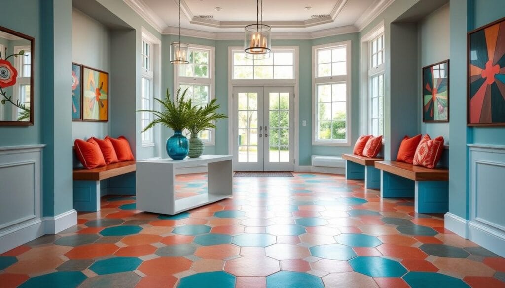
Every great space needs an anchor. Designer Kate Marker nailed this with checkered floors and mustard walls in a recent project. Your star could be:
- A bold patterned rug that hides dirt
- An heirloom mirror that bounces light
- A slim console table with personality
I once used a thrifted dresser as a drop zone – now it’s the first thing guests compliment!
Select a Harmonious Color Palette
Kobel and Co.’s sunshine yellow mudroom taught me: color creates mood. Try this trick – pull hues from adjoining rooms. If your living room has navy accents, use softer blues here. For small areas:
- Light walls make spaces feel airy
- Saturated trim adds depth
- Metallic finishes catch light
Test swatches at different times – morning sun vs. evening lamps. Need inspiration? These home foyer color strategies work for any size area.
Incorporate Nesting Tables for Smart Storage
During a recent apartment tour in Brooklyn, I stumbled upon Samantha Ware Designs’ genius solution for tight entry areas. Their secret weapon? A pair of nesting tables that looked like custom-built furniture but cost less than dinner for two.
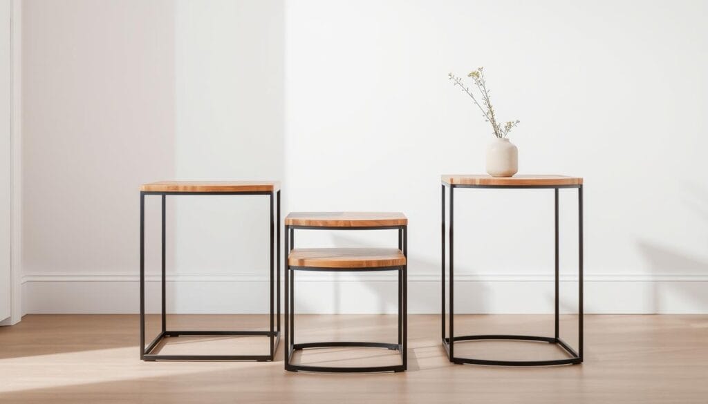
What makes these stacked surfaces so magical? They give you double the utility without eating up precious square footage. Pull them apart when you need temporary spots for packages or seasonal displays. Slide them together for daily use as a mail sorting station or key drop zone.
Maximize Functionality in Compact Spaces
Samantha’s team taught me to treat each tier differently. The taller table holds decorative items – think sculptural vases or framed photos. The lower surface handles practical stuff like baskets for gloves or charging stations. This layered approach keeps essentials handy but hidden.
When choosing your set, measure twice. Ideal nesting tables leave 4-6 inches between tiers when stacked. Round edges work better in narrow areas – no bruised hips! For cohesion, match metal finishes to existing hardware like doorknobs or light fixtures.
Found a thrifted set that’s slightly mismatched? Paint them the same semi-gloss white. Instant unity! My favorite hack: use removable contact paper on the lower table for seasonal flair. Peel it off when you want a fresh look without commitment.
Embrace Calm with Minimalist Design
Last Tuesday, during a client consultation, I watched someone exhale deeply as we removed excess items from their cramped foyer. Kate Marker calls this effect “a breath of fresh air” – that instant calm when a space breathes rather than suffocates. Minimalism here isn’t about stark emptiness. It’s crafting moments that feel intentional.
Create an Open and Airy Vibe
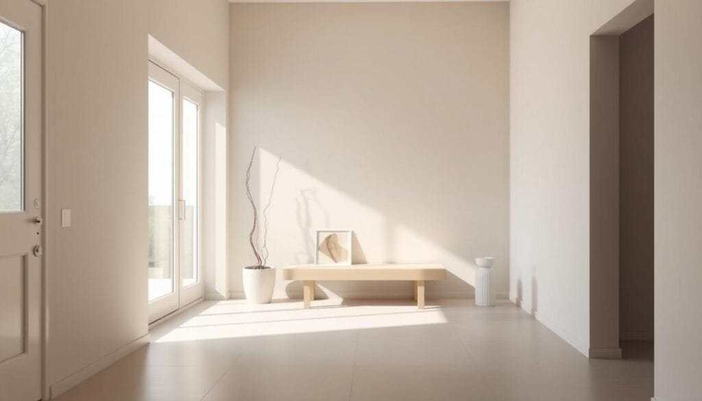
Allison Lind’s two-tone tile project taught me subtle patterns add depth without clutter. Start with these essentials:
- Clean-lined furniture with hidden storage
- One statement mirror or artwork
- Natural textures like linen or rattan
I recently styled a 4×4 foot entryway using only three elements: a floating shelf, ceramic bowl, and pendant light. The trick? Let each piece earn its place. Ask: “Does this spark joy and serve purpose?”
Negative space works magic. Leave 30% of surfaces empty. Paint walls in soft whites or warm grays to amplify light. For character, try matte black hardware or a single sculptural plant. Remember – restraint creates the luxury of room to breathe.
Make a Statement with Large-Scale Art
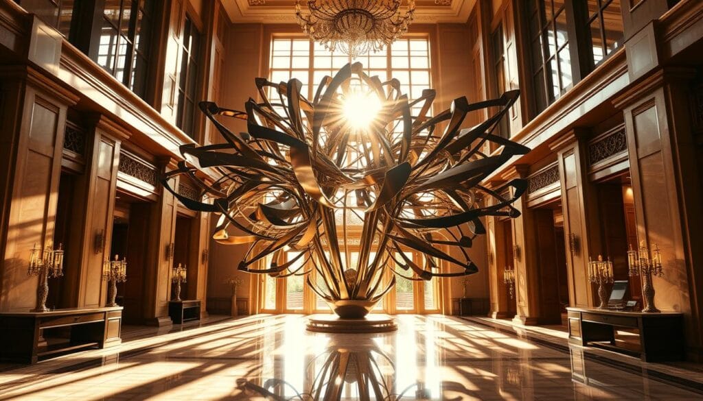
This spring, I discovered the power of oversized artwork while helping a client revamp their bland hallway. A single 4-foot abstract painting transformed the entire space into a conversation starter. Designer Brady Burke says it best: “Your walls are prime real estate for showcasing what makes your home uniquely you.”
Curate Bold Pieces to Set the Tone
Choose artwork that demands attention without overwhelming. Burke layers wall-mounted shelves beneath statement pieces, mixing travel souvenirs with candles for depth. Three rules I live by:
- Match colors to existing furniture accents
- Leave 8-12 inches between art and light fixtures
- Use odd numbers for groupings (3 small pieces > 2)
My favorite hack? Photograph your wall and digitally “hang” potential purchases using free design apps.
Balance Art with Functional Clutter Control
That stunning piece won’t shine if surrounded by mail piles. Try these dual-purpose solutions:
- Floating shelves below artwork for keys/baskets
- Console tables with drawers matching frame tones
- Oversized baskets doubling as textural decor
Last week, I styled a client’s narrow entryway using a leaning floor mirror behind their sculptural chair. The reflection made the art appear twice as impactful – genius space trick!
Stick to Classics for Timeless Entryway Styling
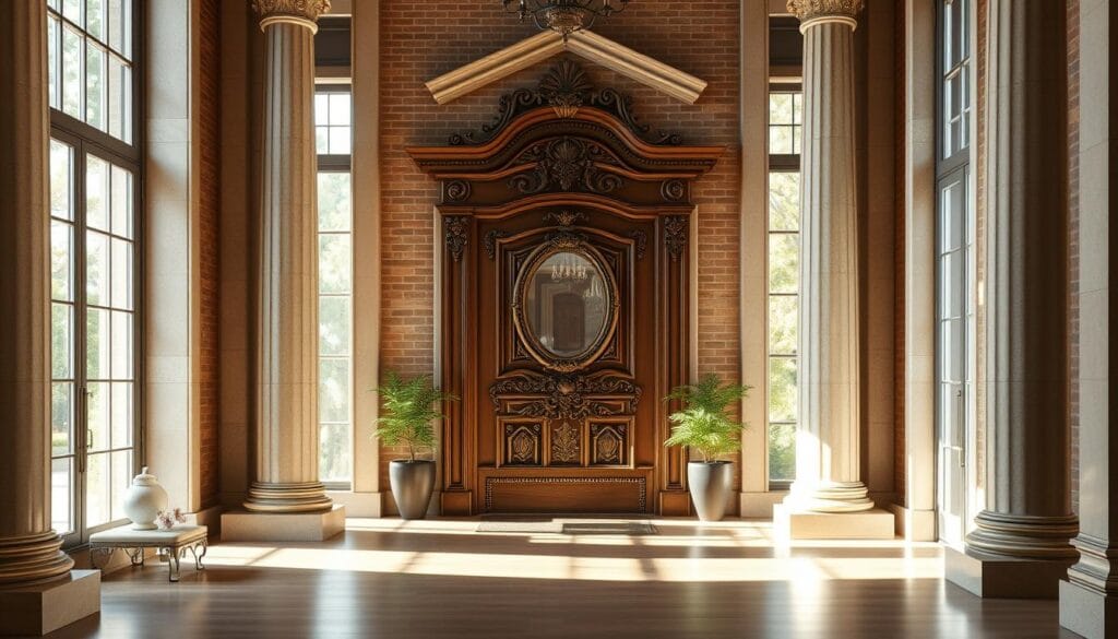
Last Thursday, a client confessed she’d redecorated her foyer three times in five years. “It never feels right,” she sighed. We swapped trendy accents for classic pieces, and suddenly – magic. That’s the power of timeless design: it whispers elegance long after fads fade.
What makes classic styling work? Start with essentials. A slim bench for shoes. A brass tray for keys. Two armchairs in peacock velvet transformed a client’s sterile hallway into a welcoming pause point. As timeless entryway design proves, simplicity lets your home’s architecture become the star.
My golden rules for enduring spaces:
- Choose furniture with clean lines that outlive trends
- Invest in quality upholstery fabrics that age gracefully
- Let moldings or original floors take center stage
I recently styled a 1920s Craftsman using only a walnut console and ceramic lamp. The result? A space that feels curated, not cluttered. Textured baskets hide mittens beneath, while open shelves display heirloom pottery.
Want personality without chaos? Add warmth through layered rugs or a vintage mirror. My client’s navy wingback chairs look fresh with seasonal throw pillows – easy swaps that keep the base timeless. Remember: classics aren’t boring. They’re the quiet backbone letting your story unfold beautifully.
Create a Miniature World with Bold Wallpaper and Color
Last weekend, I stood in a client’s freshly papered entryway and gasped. What was once a forgettable pass-through now felt like stepping into a storybook forest – all thanks to bold wallpaper. Design firm French & French proved this magic with their block-print walls and citrus-hued trim that somehow unified three connecting rooms. Their secret? Treating the entryway as a jewel box rather than an afterthought.
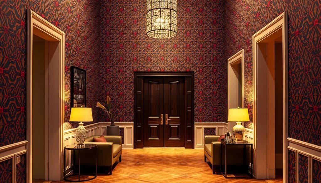
Introduce Pattern and Texture
Philip Thomas Vanderford’s black-and-white tile floor taught me: contrast makes patterns pop. When working with small spaces:
- Scale matters – large prints expand tight walls
- Textured grasscloth adds depth without clutter
- Ceiling papering creates unexpected drama
I recently used National Solutions’ embossed wallcovering in a narrow hallway. The raised geometric pattern caught afternoon light beautifully, making the wall feel alive. Pro tip: test samples under your existing lighting before committing.
Complement with Coordinated Accessories
French & French’s colorful woodwork shows how trim can enhance wallpaper instead of competing. Try these pairings:
- Match painted moldings to the pattern’s accent color
- Choose door hardware that echoes metallic flecks
- Layer rugs that pick up secondary hues
For high-traffic areas, I recommend vinyl-coated papers near doors. One client uses removable peel-and-stick panels behind her coat rack – easy swaps for seasonal moods. Remember: your design should thrill you daily, not just impress guests.
Personalize Your Space with Patterned Decor
Earlier this year, a client showed me her “safe” beige hallway. We swapped neutral tones for vibrant patterns, and something magical happened – the area suddenly sparkled with her personality. Designer Sarah Vaile proves this transformation isn’t luck. It’s strategy. Her secret? Combining unexpected prints like leopard spots with delicate florals to create spaces that sing rather than whisper.
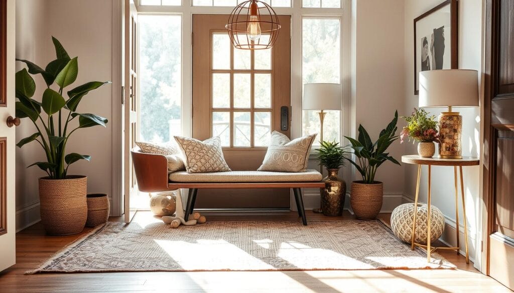
Mix Florals and Graphic Prints for Impact
Vaile’s animal-print-and-peony combo taught me bold pairings work when you follow three rules. First, anchor with a dominant pattern. A large-scale floral rug or wallpaper sets the stage. Second, add contrast. Try geometric throw pillows or striped baskets. Third, leave breathing room. Solid-colored furniture or neutral walls prevent visual overload.
My go-to trick? Use a color thread. If your floral has coral accents, echo that hue in a graphic print’s background. I recently styled a friend’s foyer using navy-and-white checks with hydrangea-patterned trays. The shared blue tones created harmony despite the mix.
Start small if you’re nervous. A patterned bench cushion paired with botanical art makes a statement without commitment. For high-traffic areas, choose durable fabrics like indoor-outdoor textiles. Remember – patterns should tell your story. That vintage scarf framed as art? That’s decor gold waiting to shine.
Add Hidden Storage Solutions Behind the Wall
Last winter, a client frantically texted me photos of her family’s daily chaos – backpacks avalanching off hooks, shoes forming a tripping hazard. Two weeks later, we transformed that chaos into calm using designer Jeremiah Brent’s genius trick: repurposing dead space into smart storage. His powder-room-to-mudroom conversion proves even awkward areas can become functional gems.
Utilize Built-In Cubbies and Hook Systems
Jihan Spearman’s under-stair cubbies taught me vertical real estate is gold. Her design gives each family member a labeled cabinet and matching hook – no more morning scrambles. Try these space-saving strategies:
- Convert shallow walls into recessed cubbies with pull-out trays
- Install flip-down benches with hidden shoe compartments
- Use magnetic panels behind doors for key storage
I recently helped a family of five create a storage wall using IKEA’s BOAXEL system. We added curtain rods with patterned drapes to hide the clutter – instant style meets function. For renters? Try over-door organizers that tuck behind home bar decor ideas – same principle, portable solution.
My favorite DIY hack: turn an old bookshelf into a cubby station. Paint the interior contrasting colors, add woven baskets for shoes, and mount hooks at varying heights for kids’ coats. Total cost? Under $100. The result? A space that works harder than a Swiss Army knife.
Express Your Style with a Curated Gallery Wall
Last Sunday, I spent the afternoon helping my friend Mia transform her bland hallway. We hung 15 mismatched frames filled with pressed botanicals – suddenly, her entryway became a living scrapbook. Those delicate maple leaves and dried hydrangeas? They tell stories better than any store-bought art ever could.
The magic lies in balance. Mix ornate gold frames with sleek black rectangles. Cluster small oval prints beside oversized square canvases. My secret? Keep one color thread – like soft sage green – weaving through every piece. It’s the visual glue that makes eclectic collections feel intentional.
Start by laying frames on the floor first. Play with spacing until the arrangement “clicks.” I recently used removable wallpaper scraps as placeholders on the wall – genius for avoiding nail holes! For organic texture, add woven baskets beneath or a trailing pothos plant nearby.
Remember: your gallery should mirror your life’s adventures. That ticket stub from Paris? Frame it beside a pressed rose from your garden. Those wildflower sketches your kids made? Perfect companions. When every piece sparks joy, your style shines through effortlessly.
